
Simple Statistical Analysis
See also: Designing ResearchOnce you have collected quantitative data, you will have a lot of numbers. It’s now time to carry out some statistical analysis to make sense of, and draw some inferences from, your data.
There is a wide range of possible techniques that you can use.
This page provides a brief summary of some of the most common techniques for summarising your data, and explains when you would use each one.
Summarising Data: Grouping and Visualising
The first thing to do with any data is to summarise it, which means to present it in a way that best tells the story.
The starting point is usually to group the raw data into categories, and/or to visualise it. For example, if you think you may be interested in differences by age, the first thing to do is probably to group your data in age categories, perhaps ten- or five-year chunks.
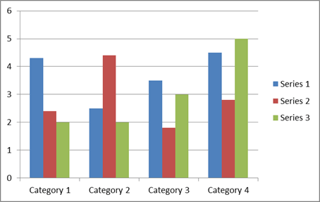
One of the most common techniques used for summarising is using graphs, particularly bar charts, which show every data point in order, or histograms, which are bar charts grouped into broader categories.
An example is shown below, which uses three sets of data, grouped by four categories. This might, for example, be ‘men’, ‘women’, and ‘other/no gender specified’, grouped by age categories 20–29, 30–39, 40–49 and 50–59.
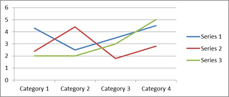
An alternative to a histogram is a line chart, which plots each data point and joins them up with a line. The same data as in the bar chart are displayed in a line graph below.
It is not hard to draw a histogram or a line graph by hand, as you may remember from school, but spreadsheets will draw one quickly and easily once you have input the data into a table, saving you any trouble. They will even walk you through the process.
Visualise Your Data
The important thing about drawing a graph is that it gives you an immediate ‘picture’ of the data. This is important because it shows you straight away whether your data are grouped together, spread about, tending towards high or low values, or clustered around a central point. It will also show you whether you have any ‘outliers’, that is, very high or very low data values, which you may want to exclude from the analysis, or at least revisit to check that they are correct.
It is always worth drawing a graph before you start any further analysis, just to have a look at your data.
You can also display grouped data in a pie chart, such as this one.
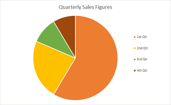
Pie charts are best used when you are interested in the relative size of each group, and what proportion of the total fits into each category, as they illustrate very clearly which groups are bigger.
See our page: Charts and Graphs for more information on different types of graphs and charts.
Measures of Location: Averages
The average gives you information about the size of the effect of whatever you are testing, in other words, whether it is large or small. There are three measures of average: mean, median and mode.
See our page on Averages for more about calculating each one, and for a quick calculator.
When most people say average, they are talking about the mean. It has the advantage that it uses all the data values obtained and can be used for further statistical analysis. However, it can be skewed by ‘outliers’, values which are atypically large or small.
As a result, researchers sometimes use the median instead. This is the mid-point of all the data. The median is not skewed by extreme values, but it is harder to use for further statistical analysis.
The mode is the most common value in a data set. It cannot be used for further statistical analysis.
The values of mean, median and mode are not the same, which is why it is really important to be clear which ‘average’ you are talking about.
Assessing summary measures: robustness and efficiency
There are two constructs (ideas or concepts) that are commonly used to assess summary measures such as mean, median and mode. These are robustness and efficiency.
-
Robustness is a measure of how sensitive the summary measure is to changes in data quality.
These changes in data quality can arise either through outliers, extreme values at either end, or from actions taken during analysis, such as grouping the data for further analysis. A robust measure is NOT sensitive to these changes. The median is therefore more robust than the mean, because it is not affected by outliers, and grouping is likely to lead to very few changes.
-
Efficiency is a measure of how well the summary measure uses all the data.
A more efficient measure uses more data. The mean is therefore very efficient, because it uses all the data.
These two measures are therefore often contradictory: a more robust measure is likely to be less efficient.
You will need to decide which is more important in your analysis.
Measures of Spread: Range, Variance and Standard Deviation
Researchers often want to look at the spread of the data, that is, how widely the data are spread across the whole possible measurement scale.
There are three measures which are often used for this:
The range is the difference between the largest and smallest values. Researchers often quote the interquartile range, which is the range of the middle half of the data, from 25%, the lower quartile, up to 75%, the upper quartile, of the values (the median is the 50% value). To find the quartiles, use the same procedure as for the median, but take the quarter- and three-quarter-point instead of the mid-point.
The standard deviation measures the average spread around the mean, and therefore gives a sense of the ‘typical’ distance from the mean.
The variance is the square of the standard deviation. They are calculated by:
- calculating the difference of each value from the mean;
- squaring each one (to eliminate any difference between those above and below the mean);
- summing the squared differences;
- dividing by the number of items minus one.
This gives the variance.
To calculate the standard deviation, take the square root of the variance.
Skew
The skew measures how symmetrical the data set is, or whether it has more high values, or more low values. A sample with more low values is described as negatively skewed and a sample with more high values as positively skewed.
Generally speaking, the more skewed the sample, the less the mean, median and mode will coincide.
More Advanced Analysis
Once you have calculated some basic values of location, such as mean or median, spread, such as range and variance, and established the level of skew, you can move to more advanced statistical analysis, and start to look for patterns in the data.