
Statistical Analysis:
Understanding Correlations
See also: Statistical Distributions
One of the most common statistical tests is to see whether there is a link between two variables—that is, if you change one variable, will the other also change? This type of link between variables is known as a correlation or association.
Knowledge about this type of association is useful, because it means that you know that if one variable changes, the other one will also change. You can then measure one of the variables, and use that to predict the level of the other.
There are, of course, caveats to this: you need to be aware that the relationship may vary at higher or lower values of one or other variable, and your result will only be a prediction, not an absolute. However, this can be useful when one of your variables is much harder to measure objectively.
For more about the difference between objective and subjective data, see our page on Types of Data.
Defining Associations
Associations between variables are often described as either positive or negative, and weak or strong.
A positive association means that high scores for one variable tend to occur with high scores for the other.
A negative association means that high scores for one variable tend to occur with low scores for the other.
There is no association when the score for one variable does not predict the score for the other.
A strong association is when even a small change in one is associated with a change in the other.
With a weak association, a bigger change in one may be needed before you see a change in the other, or you may need a lot more data to see the association.
The Difference Between Correlation and Causation
A correlation is an association between two variables. It does not necessarily imply that one causes the other.
Both could be caused by something completely different, or it could simply be that people who show one characteristic often show the other.
For example, suppose that people who shop for groceries online buy more ready-made meals than those who shop in store. There is therefore a positive correlation between the two.
However, it is unlikely that the act of buying online causes the purchase of more ready-made meals. It is more likely that those who shop online are short of time, and so buy more convenience food, or possibly simply that younger people are more likely both to shop online and to buy convenience food.
An example of correlation but not causation: stork sightings
In Sweden, stork sightings are correlated with birth rate. In other words, towns with a bigger birth rate report more stork sighting.
Does this mean that the old tales are true, and storks really do deliver babies?
No.
There is a factor that is linked to both: the size of the town. Bigger towns have larger populations, so a higher birth rate. They also have more people who are likely to see storks—and more houses for storks to nest on the roofs.
Seeing an Association
One of the best ways of checking for an association is to draw a scatter plot of the data with the two variables on the x and y axes. Broadly speaking, if there is an association, you will see it from the graph.
Direct Associations (Linear or Straight-Line Associations)
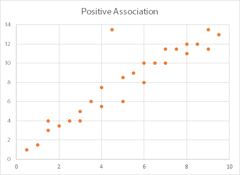
In this graph, as the values on the x-axis (along the bottom) increase, so do the values on the y-axis. There is therefore a positive association between the two variables. We can also say that ‘x is directly proportional to y’.
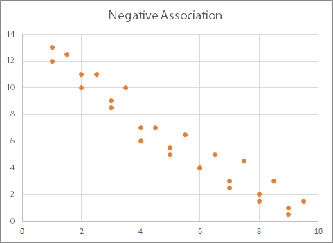
In this graph, you can see the opposite effect: as the values on the x-axis increase, the values on the y-axis decrease. This graph therefore shows a negative association (or inversely proportional relationship) between the two variables.
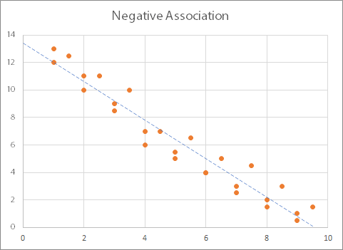
Both these graphs show what are known as linear or ‘straight-line’ relationships: when plotted on a graph the relationship between the variables show a straight line (more or less). You can add what is known as a ‘best fit line’ or ‘trend line’, and it will be straight:
How would you know if there was no relationship? The graphs would look quite different, depending on whether both variables changed or only one.
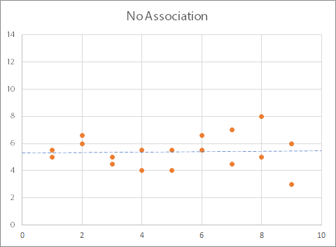
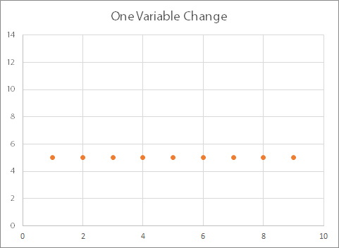
This graph shows that there is no relationship between the two variables: as one changes, the other does too, but not in any particular pattern. The trend line is (more or less) horizontal. You may also see graphs where one variable changes, but the other one stays the same, like this:
Identifying Other Relationships
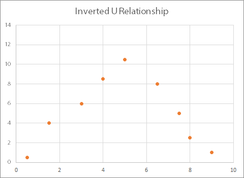
Drawing a graph will also help you identify if there is a peculiar relationship. This might include, for example, where there is a positive association for part of the data and a negative for the rest, as shown below. This will show in a test as no correlation, but there is clearly some sort of a relationship in this case.
This example is known as an ‘inverted U’ relationship.
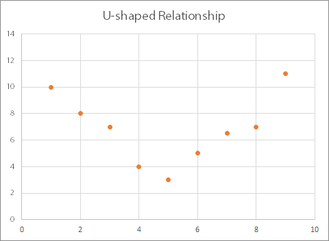
The opposite is known as a ‘U-shaped’ relationship:
Both of these types of relationships can be described using a (broadly) quadratic equation (and for more about these, you may like to read our page on Simultaneous and Quadratic Equations).
You may also see what is known as an exponential relationship:
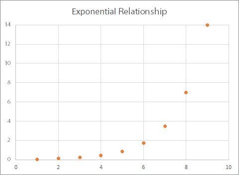
Here, for every increment (increase) of one in the value of x, there is a doubling of the value of y.
Statistical Tests for Associations
The data used here are all fairly obvious: the graphs show that there is a clear relationship between the two variables. However, real-life data are seldom so convenient.
You can therefore use statistical tests to identify whether there are relationships between two variables.
Your choice of test will depend on the type of data (and see our page on Types of Data for more about the distinctions between data).
There are specific tests depending on whether you are using continuous, categorical or ranked data.
For categorical data, you use the chi-squared test (also written χ2).
This measures whether the variables are independent. However, it will not tell you anything about the type of relationship, only that there is a relationship.
For continuous data, the most common test is the Pearson product-moment correlation.
This measures the strength and direction of a relationship between two variables. It can only be used where the relationship is linear (straight-line), so if you have a u-shaped scatter plot, it cannot be used. In this case, you can either split the data into sections, or rank your values and use a rank correlation instead.
Your data also need to be approximately normally distributed (there is more about this in our page on statistical distributions).
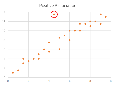
Before you use a Pearson correlation test, you should also remove any outliers (another reason to use a scatterplot first). The diagram below shows a scatterplot with one major outlier (ringed in red), which should be removed before running a Pearson analysis.
For ranks, use the Kendall rank order correlation or Spearman’s rank correlation.
Carrying Out Statistical Correlation Testing
For each of these tests, the basic procedure is the same.
You work out the value of a ‘test statistic’ by using a standard formula that is specific to your chosen test, and inserting your variables into the formula where required. You then compare this test statistic with the value needed to obtain the desired level of significance, which you obtain from a statistical table. This tells you how likely it is that the two variables are related in some way.
Significance
Significance means how confident you are that this relationship has not occurred by chance. Researchers generally measure significance to the 1% or 5% level, which means that they are 95% or 99% confident that any observed relationship is not due to chance.
There is more about the meaning of significance in our page on Significance and Confidence Intervals.
Using Statistical Software
Measuring relationships using statistical testing sounds complicated. However, in practice it is relatively straightforward. If you are doing it by hand, you use standard formulae, and compare your test statistic against values obtained from standard and widely available statistical tables. However, most researchers use statistical software packages, which do all the work for you. They will calculate all the test statistics, and some will even highlight the level of significance.
Further Reading from Skills You Need
The Skills You Need Guide to Numeracy
This four-part guide takes you through the basics of numeracy from arithmetic to algebra, with stops in between at fractions, decimals, geometry and statistics.
Whether you want to brush up on your basics, or help your children with their learning, this is the book for you.