
How to Present Statistics and Analytics
in an Effective Manner?
See also: Graphs and Charts
“Statistics is the grammar of science.” – Karl Pearson
Data and statistics are part of almost every sector and are used to understand and drive results.
These are essential tools to make decisions, answer important questions, summarize big data, recognize patterns, prove theories, etc.
A good presentation gets the backing of data and statistics, but data alone will not guarantee the success of a presentation.
How you choose to present that data either doubles or decimates the impact of your presentation.
While you get weeks working on the charts and numbers, your audience gets only a few minutes to go through the content. So, it becomes all the more imperative that you present it in the most comprehensible way possible for them to understand and remember.
Unfortunately, most of us, at some point, have sat through presentations where the slides didn’t make much sense, and we had to rely on the speaker to know more.
So, take the help of these pointers to turn your complex numbers into interesting information. Let’s begin.
Tips to Deliver Statistics and Analytics in an Impactful Manner
Your presentation might look boring and lengthy if not presented well. Here are some quick tips to make your data lively and impactful.
1. Graphics are the Way to Go
Imagine a slide with a lot of data and numbers presented just like that. How difficult would it be to make sense of it or to read it?
Graphics and visuals are the most powerful way to present numbers. It can make your data easy to understand, livelier, and better accessible to your audience. Graphics and visuals help break down complex and intricate information into readable content.
Keep these tips in mind when using graphics-
Your visuals should not overlap the text and vice versa.
The graphics should be in alignment with your brand and the broader theme of the presentation.
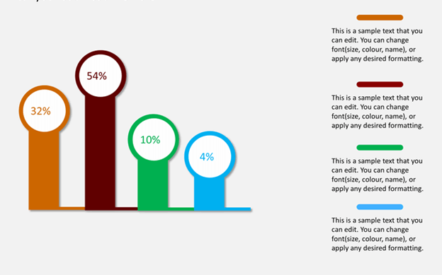
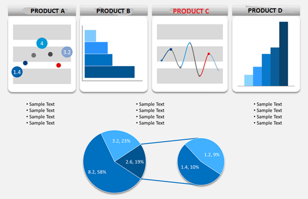
Choose the right graph. For example, a bar graph is apt when you want to compare, and a line graph can be used to depict changes over time.
Useful Tip
You can use pre-designed presentation templates featuring relevant graphics and charts to complement your statistical and analytical data and present it in a simple yet trendy way.
Stories and Analogies are Incredibly Powerful
Do you know what mnemonics and memory palaces do? They help you associate the things you want to remember with certain other easy-to-remember things (which you already know).
It took you a lot of time to craft all that information in your presentation, and consider it a bonus if people will remember parts of it later on.
Storytelling is one of the most potent ways to capture attention and aid memory retention. Try to weave a story around the data to help people understand and recollect the data better.
Analogies will help soften the impact of everything technical and non-understandable into something familiar to the audience.
For example, if your presentation is about business growth, you can highlight the increase in numbers with what took you to reach there, i.e., how you improved the website’s visibility, interface, etc.
For more understanding, watch this video displaying a few stunning examples of data storytelling.
3. Highlight Points that Your Data is Illustrating (Inference)
When you present data on the slides, it is not that the numbers hold the real value but the inference drawn from it. Remember to highlight well how the statistics and analytics support your major points.
Don’t leave the decoding part to the audience, or your audience won’t be able to process the relevancy of your argument. When you want to connect the statistic with an inference, make sure the transition is clear with terms such as ‘the numbers show,’ ‘this data proves,’ ‘this figure/chart illustrates,’ etc.
The transitions are critical to bringing everyone’s attention to the most important part of relating to and explaining the conclusions. Not everyone likes to crunch numbers, so highlight the inference in such a way that there is no scope of confusion left for people.
4. Your Data Should be Visible
It sounds obvious, right? But it is a common mistake while placing data on the slides. When you have a lot of information to share, with only so much place on a single slide, it might so happen that some content is aptly visible on a laptop but not so much from a distance in the actual presentation.
To avoid the debacle of having to translate poorly visible numbers and labels, practice your presentation by having people sit as far away as in the actual presentation. Make sure that each slide is clearly visible and readable with all information.
It will also help you align and tweak the material on the slides (keeping only the relevant and required content).
5. Share Only One Piece of Information
When you have a lot of information to share, it becomes an impulse to share everything you know. It is also hard to filter out information that you can exclude from relevant figures. And last, a lot of presenters feel that they are required to share all the information they present - on the slides - as well.
Result?
Chaos on the slides with too many details and overuse of the negative space – yes, it will show people the work you have done and the data you have collected, but it will be just that. It will confuse your audience and miss the point for you.
Include data points that significantly support your main argument, and it should be one point on one slide/chart. Enquire yourself what’s the most important learning that you want people to take from that data. Convey that to people.
If you have multiple key points, present each with new visualizations. It will help you demarcate your presentation neatly into understandable chunks and help people remember better. Also, refrain from including unnecessary information that doesn’t directly affect your main point.
6. Use Colors Wisely
Colors will help you differentiate between figures and charts. It can help people figure out the before and after clearly. Presenting the data in black and white wouldn’t be impactful.
Remember to use colors consistently when presenting the same values in a chart. You wouldn’t want your audience confused and draw inaccurate conclusions by highlighting a similar figure in different colors. You can also use brand colors in your presentation to appear more professional.
Another way of using the colors in a user-friendly way is by matching the axis and series colors when you are presenting a dual-axis chart. It will help your audience match the series with the respective axis easily. There are a lot of other ways in which you can use colors to bring coherency and life to your data.
7. You can Present the Data in Stages
Animating your charts will make the data look less intimidating and help people derive more information from the figures. Presenting your data in stages will enhance comprehension and give everyone time to process it properly.
For example, let’s say you are showing the sale of 2 products. You can show the chart in 3 stages by explaining the axes in one, then a chart for the sale of product X as a base (2nd stage), and after that for product Y (3rd stage).
PowerPoint has a chart animation feature that lets you do it by series or category.
The technique will aid you in presenting your data effectively and efficiently.
8. Go Simple
Don’t scare your audience with a barrage of numbers. You have had time to soak in everything you want to tell, but this won’t be the case with people sitting in front. Try to be simple with the data you are presenting. For instance, keep the format of your number simple. Don’t make people count the number of zeroes like 10000 vs. 1000000.
Try to include decimals (skip unnecessary decimals) for numbers that are close to each other in a range of values and not for numbers as far away as 2-90%. If your numbers are within a few percent range of each other, it is important to use decimals.
Another factor that can help simplify your data is keeping the numbers right-aligned always. It can help people scan the numbers (to study), which becomes a little harder in the case of center-aligned numbers.
9. Initiate with the End
Try to start by giving the bottom line up front. Let us explain what it means. Your audience will naturally scan your slide from top to bottom. Your titles should give a clear picture of your chart. Rather than going for vague titles and letting people fumble through the slides to figure out the key message – share a clear title that will immediately let them know what to look for in the slide.
For example, let’s say your chart is about a certain product’s growth over other products. Go for a title that says Product C’s growth over the last quarter. Your audience will automatically start scanning the relevant figures related to this product and save time and effort.
Your slide title should be point specific and reinforce the main point. Try not to go for generic words and phrases serving no functional purpose.
10. Remember to Present to the Audience
One mistake that you can make while presenting statistics and analytics is focusing too much on your slides. After all, even you wouldn’t remember all the figures.
It can be detrimental for you as a presenter, as you would not be able to connect to your audience and might look uncompetitive. Therefore, try to keep your gaze on the audience, for they will be able to understand better when you speak while maintaining eye contact.
You can keep cue cards for your reference and look at your slides here and there while emphasizing a point to the audience.
In a Nutshell
Incorporating data and statistics to add credibility to a presentation is a common practice. And finding relevant data is not difficult either. However, how you choose to present that data will define the impact of your presentation.
Keep these above tips in mind to make your figures speak to the audience efficiently.
They will make your presentation appear crisp and appealing and bring life to your statistics and analysis.
Also, remember your presentation should have a clear take-home message. People should know what they are supposed to do with what you have shared. You can include a clear CTA in your presentation to guide everyone better.
About the Author
Ashish Arora is Co-Founder of SketchBubble, a leading provider of result-driven, professionally built PowerPoint templates.
Travelling the world to gather new creative ideas, he has been working in the digital marketing space since 2007 and has a passion for designing presentations.