Can Presentation Science Improve Your Presentation?
See also: Self PresentationScientific research points to a best practice for creating presentations. But, interestingly, the research also shows that most presentations go against these research findings!
We have come to expect a low level of engagement from PowerPoint presentations: they are usually slow, tedious, confusing, and, ultimately, deal-breaking. It seems okay to deliver something average, because the person before you just delivered something average…
Indeed, few people give honest or helpful feedback to presenters, so we tend to just grin and bear it. Yet we often dread having to sit through presentations, and the phrase “Death by PowerPoint” exists for good reason.
But times are changing. Awareness of presentation design agencies is increasing, and alternative software is emerging: both factors are now influencing how presentations look and behave.
Indeed the standard of PowerPoint is also changing, with Microsoft adding features regularly to the 365 version, yet few people can use it really well. No matter what your ability is with the software, you can still do a lot of simple things to transform your presentations!
In this article, we want to focus on how scientific presentation guidance can help you to build a better presentation:
- 3 rules of brain science
- 3 steps to a great presentation structure
Get both of these areas right, and your audience will have a much better experience. And so will you!
3 Brain Rules:
These are essential when it comes to presentations:
Brain rule #1:
Respect the limits of working memory
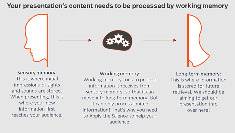
The human brain learns by transferring information from its working memory into its long-term memory.
Since the aim of every presentation is to be remembered (at least it should be!), we need to make the most of what working memory can and can’t do. The main hurdle is that working memory has a limited capacity: it can only hold a certain amount of new information at any one time. So this means you can’t just present everything, in any old way, and expect your audience to get it.
There are a number of methods you can employ that will assist in the transfer of your information from working memory to long-term memory. One of them being the use of templates for scientific presentation that already have a definitive structure which will not allow you to overload your audience with text. Visually appealing PowerPoint templates are a great way to organize your presentation and make it more clear and engaging for the audience.

Scientific methods to help your slides be easier to recall:
Coherence principle – be clutter free!
Learning improves when multimedia is free from extraneous information. This may sound obvious, but make sure you remove all objects, pictures, animation, logos, gloss and shine that do not contribute to your message. This applies to everything, including charts – check out Edward Tufte’s “ChartJunk” . One simple bit of advice to follow is to not show both data labels and an axis: by keeping only one, you can visually clean up the number of lines, text and objects within the chart. Cleaner looking charts are faster to understand, and they look and feel better too.
Spatial Contiguity – use space judiciously!
Learning improves when words are placed near relevant pictures.
For example, a pie chart with a legend takes longer for the brain to understand than a pie with labels on top of the slices (or close by).
You may find that legends look “tidier”, but your audience’s brains will find them tougher to digest. It’s just a little thing, but these little things really add up!
Redundancy principle
This proves that learning reduces when information is redundant – such as reading verbatim from your slides.
Your audience doesn’t need to both read and listen to information – we look at this in more depth in the next brain rule. Other redundancies could be visual items like a logo. It takes up screen space and is ultimately ignored by the viewers - so you may need to question whether you need it at all? And if it’s not being ignored, well, that’s even worse as it’s distracting your audience! Either way, (apart from keeping marketing/compliance happy) you probably don’t need it on every slide.
Brain rule #2:
Address the visual & verbal channels
Humans use separate brain channels to process visual input and verbal input. So, let’s relate this fact to presentations:
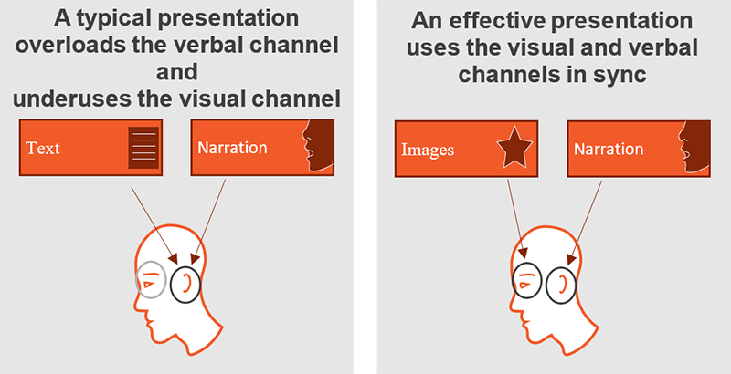
A typical presentation is ineffective because the majority (if not all) of its content is Text with Narration. So during a presentation, the audience is overloaded by two sources of information hitting just one channel: the verbal channel.
Note: it’s often assumed that text is processed by the visual channel, since we read with our eyes, but in fact it’s internally processed by the ears as we listen to ourselves read.
Therefore both text and narration go via the verbal channel, overloading that one channel and creating a split attention effect. Your audience will attempt to listen and read at the same time. It’s just not possible to do both simultaneously (even if people think they can!) and attention will be lost.

The human brain is at its most effective when it processes information simultaneously via both the visual and verbal channels. Therefore there’s one sure-fire way to make your presentation better, and that is to address both channels in a complementary way!
Simply put, use images and narration.
However, be careful, as using the wrong image can do more harm than good! It is way too easy to adopt the “yeah yeah, I know, add images” mantra. Many people think adding images is the answer to creating great presentations: but it’s very common for presentations to contain narration, text and poorly targeted images. This renders slides equally ineffective at communicating with your audience.
Poorly targeted images do more harm than no images – they provide conflicting visual and verbal information. What’s more, visuals that are decorative are highly likely to prompt the brain to wander…
…for example, since we can’t control what each individual will start day dreaming about, use photographic imagery with great care. Photos may look amazing in slides, but your audience will often remember the photos, and their feelings/thoughts associated with them, rather than your message!
To sum up, it’s been shown that people have 6x better recall when both verbal and visual channels are used in perfect harmony! This is called 'Dual Coding Theory'.
Brain rule #3:
Guide your audience’s attention
Whilst it’s important to get audience attention as early as possible, you’ll also need to hold it. And that’s the hard part.
Remember that your audience will usually be thinking of 101 different things when they sit down for your presentation (and expecting another ‘Death by PowerPoint’ experience!)
So as your presentation progresses, and you reach the nitty-gritty slides, there are a number of important measures you can employ to assist the mind to process the information on your slides.
You can make things much easier on your audience’s working memory by presenting new information in a way that follows a familiar pattern. Familiar devices would be things like a graphical pattern, a recognised order, a recognisable structure or concept. By tapping into your audience’s prior knowledge, their working memory is much more likely to be able to process and transfer your new information into long-term memory.
Signalling principle is another useful and technique – it shows that learning improves when attention is focused on important parts of the presentation.
This could be through the simple use of arrows or icons to direct attention to the important area of the slide. Or it could be the use of a particular colour for your key points, whether for shading or for text. Headlines themselves are a good signal and will help your audience to understand a complex slide by telling them what they need to know first. Remember to use them sparingly: you don’t want to overload either!
Graphics & visuals are great when you need to simplify a complex idea, something abstract or a highly detailed system or process.
An illustration may be easier for the mind to understand than a lengthy text explanation, but some graphics may still be difficult to understand immediately.
In such cases where the visual is not perfectly intuitive, you can use a technique we mentioned earlier: the Spatial Contiguity principle. By adding text to the relevant parts of the visual it describes, you can effectively guide attention and assist learning. You can also use animation to introduce parts of the diagram bit by bit.
Animation: Whilst it is proven that animation commands attention, we do not want the movement to distract from the key messages in the narration or on the slide.
For this reason, we recommend using animation only where necessary: i.e. to control the flow of information (e.g. content to appear in sync with narration).
Of course if you’re creating a video-type presentation, using motion animation, then the timing needs to be fast and dynamic – waiting for a drawn-out animation to finish is a very bad thing indeed.
Simply put, your animation must serve a strict purpose.
Now you know some of the science, follow these 3 steps to help you reach your presentation goal.
If you can engage, connect, and make your audience want to act, then you know you’ve given a good presentation.
Step 1: Choose story thread
The first few slides of your presentation are key. Generally, you will have your audience’s attention at the very start – but it won’t last long if you don’t show them relevance! Your job is to keep their attention.
You do this by ensuring your initial slides make them want to focus on the rest of your story.
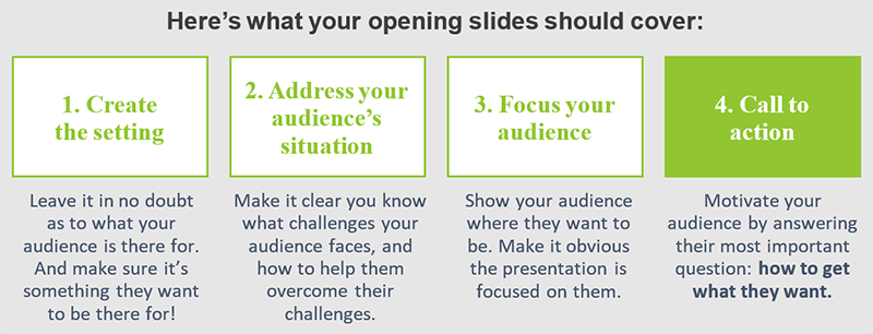
Your opening needs to set the scene, establish your story and show your audience that your presentation is relevant to them. By getting your audience interested, they are more likely to participate in your story.
We typically use 4 slides to set the scene. With ‘Call to action’ (4) being the most important of your presentation. It’s your purpose slide, and is the reason you’re presenting.
It may feel strange to state your purpose so early on, but it’s a highly effective technique. Your audience wants to know your purpose and their purpose – so tell them.
We credit Cliff Atkinson from Beyond Bullet Points for this highly effective structure

Addressing the audience’s needs will help you connect with their emotions, persuade them they want to participate in your story, and focus them on the path forward.
Step 2: Plan priority & sequence
Your next step is to validate and expand on the opening slides. This is the meat of your presentation – and with a lot of information to pass on, this is where it can get messy!
If you present your audience with an unstructured, unprioritised series of slides, the limited capacity of their working memory will be overwhelmed and they won’t take much in.
Plan your key messages
So plan a hierarchy of ideas, and then work out which are your priority messages. This helps to guide your audience to exactly where they should focus their working memory.
You need to employ a system which will help you clarify your content by prioritising your slides strategically.
2-4 key messages is typical, and 3 is common: you don’t want much more than that. Each key message should tie in closely with your call to action. If your key message doesn’t back up your purpose, then it’s unlikely to be the right message for your audience.
Carefully plan the words you’ll use and the angle of the key message. Keep your audience at the heart of your messages: they should benefit from everything you tell them.
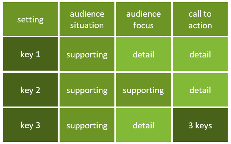
We recommend using a ‘tree diagram’ to map the priority of your points.
- Level 1: each of your key messages is Level 1.
- Level 2: at the next level, you have slides that support your Level 1 key messages with evidence, explanation or detail.
- Level 3: these slides in turn support each Level 2 slide if necessary.
Any information that doesn’t fit into this system of supporting your key messages probably shouldn’t be in your presentation. Get rid of it!
In slide sorter view, your presentation will start to look like this:

Step 3: Write your headlines
Once you’re happy with Steps 1 and 2, you can then start going into the detail. Each slide should integrate seamlessly into your story by using the right headline, narration and carefully designed graphics.
If even one aspect goes out of sync, you risk losing your audience’s attention as their brain tries to figure out exactly what’s going on!
The way you should write your headlines is quite different to the way they’re often written. You’ll recognise ineffective headlines like ‘Who we are’ or ‘Financial report’. This kind of headline doesn’t help. A headline should tell your audience something. It’s a waste of time and space to use your headline to simply sum up the subject area you’re about to cover in your slide. This won’t focus your audience at all. You need to make the most of your headlines.
Your headline should cover the key message of the slide, so make sure your most important point is in there. Not only will you prepare your audience for what’s to come but, if they switch off and miss what you’re saying, at least they’ll take the key point from your headline!
If you want scientific proof of the value of well written headings, click to read more: How the Design of Presentation Slides Affects Audience Retention.
When you compile your slides you need to:
- Write your headlines first
They should be concise and written in complete sentences, with subject and verb in active voice. They should be clear, direct, specific and conversational. They should also be relevant and link your ideas across slides, so the story flows.
- Then plan your narration
Keep your narration in the notes area and not on the slides! Also keep your slides free from unnecessary text, and make sure your narration is relevant to each headline.
- Then add graphics that match your headlines & narration
The visuals are the trickiest to get right. Most presentations use ‘decorative’ visuals that might look great, but don’t add substance. Such visuals are distracting and will draw focus away from the point you’re trying to make.
Visuals should match your goal, whether your presentation is to inform or motivate, or to sell or persuade - each of these goals will dictate which type of graphic will work best on your slides. You also need to take into account the visual literacy of your audience - measuring both their applicable prior knowledge as well as their individual visual ability.
Hot tip:
Look at your slides in slide sorter view. Read the headlines across the top and see if your story flows from one slide to another. If it doesn’t, rewrite your headlines!
Further Presentation Tips:
Passion & Purpose:
Believe in yourself and your subject matter. Give yourself a goal and be passionate about it. This is incredibly important. If you’re not passionate, then it’s much harder for the audience to believe you.
Remember the audience is on your side: they don’t want you to fail, so take support from them and deliver the message you have planned with confidence.
Try not to sit or stand still with your head down just reading from notes. Move around, gesticulate, use facial expressions and other body language to help the communication process.
Perfection:
Mistakes are human, understandable and no big deal. It’s how you recover from mistakes that shows your professionalism.
Your audience won’t even notice some mistakes (e.g. content order) so don’t worry, don’t mention it and simply move on. They may notice other mistakes (e.g. information error) so do mention it, apologise, and move on. Feeling less stressed about perfection makes mistakes less likely to occur.
People:
Know your audience. Show them as early as you can that you understand who they are, and what challenges they face. Look at trends, competition, and key issues. Make sure your presentation is targeted to them. If you have a new audience for your next presentation – retarget that presentation too.
That’s it!
We hope that you’ll feel better equipped to not only create scientifically improved presentations, but also to understand why it’s so important to adhere to presentation science.
About the Author
Philippa Leguen de Lacroix is the co-founder and director of UK presentation design company Presented. Presented specialise in improving presentation design with science. Presentations are then more memorable, and create a far more enjoyable experience for the audience.
