
Typography: It's All About the Message in Your Slides
You have your verbal presentation ready.
Now, it’s time to create those slides that will reinforce the important points – those things the audience must remember, if you are to consider your presentation a success.
Just as important as the words you carefully choose for your slides (the verbal language) will be the typography (visual language) that you use.
What is Visual Language?
Visual language is the additional meaning that you are creating by the look of the words on your sides. And to create visual language that is meaningful, you must select font, size, colour, and positioning of your words so that the connotations, not just the denotations, are understood.
Think about the word “goodbye” for a moment. How many different ways can you say it? If you are angry with someone and you are storming out, you will be extremely loud and forceful when you say the word. If you have had a lovely time and you are now leaving a loved one, you will say “goodbye” very differently.
Now think about how typography can convey those two separate meanings of the same word:

The first is a command. If you are telling an audience “Goodbye” like this, it is as if you are really saying “Get out!”
On the other hand, the second “Goodbye” is a bit playful, certainly gentler, and is said with a smile and a good thought.
In the first example, the word is centred and block big letters. The font is simple – no fooling around here!
The second example “invites” people to leave at their leisure – no rush, no urgency.
Consider the Context
Context includes both your audience and the type of message you are sending. This should be carefully reflected in the typography of your slides.
Audience:
Try to get a “persona” in your mind of your audience – the typical individual to whom you will be presenting. Think of a few words that describe this persona – Young? Old? Conservative? Progressive? Intelligent? Mature? Immature?
Now, start looking at examples of type – as you look at each example, what are the first words that come into your mind. If they don’t match words of your audience persona, keep on looking. For example, if you are making a presentation to a conservative group of bankers or investment professionals, you will want a more traditional font that is a bit bold. If, on the other hand, you are presenting to a group of college students you can choose a font that is a bit more relaxed and playful.
Your Message:
What type of message are you conveying with your presentation? Is it serious? Sombre? Humorous? Entertaining? Poignant?
A communicative PowerPoint presentation will use type that matches the mood of your message. Again, start looking at type and consider what first comes to mind when you see it. Match your first “gut feeling” with your message type.
Hint:
If your audience is older, conservative, or businesslike, and your presentation is serious, then your fonts will be more traditional, straight and simple.
If you audience is younger and progressive, but your topic is still serious, still use a simpler font, but perhaps one with just a bit of flair.
Obviously, if your topic is humorous, you can be playful with fonts.
Don't Forget About Colour
Typography is not just about font, size and position. Colour also has a major role to play. Dependent upon the message, there are certain colours that will psychologically portray the mood.
Take a look at the use of red in this following graphic. It is part of an ad campaign of Greenpeace calling attention to deforestation:
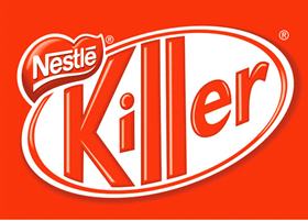
Here the colour connotes urgency; the typography imitates exactly that of Nestlé’s Kit Kat bar. At first the viewer may not see the word “Killer” instead of “Kit Kat,” but it does sink in eventually and the impact is pretty startling. Because cocoa trees grow in very specific rain forest conditions, Nestlé’s continued destruction of the trees to harvest cocoa for its chocolate is impacting the entire rain forest ecosystem.
Be Mindful of the Physical Features of the Word Itself
This may at first sound ludicrous, but words have geography.
They have length, they have syllables, and the letter arrangements give words a definite shape. Be mindful of words when you decide on the type to use, because they must be legible and readable by your audience. Don’t make them work for it.
If you have a long word, for example, do not use a complex typography. Your viewers are trying to process the word itself. The more ornate the typography, the more time and energy the viewer has to spend reading it, and the more time and energy spent, the more the message is lost.
Calligraphy is for tattoos, not for content that must be read and understood.

See the difference?
If you are making a presentation on homelessness, proper typography calls for a serious font, and the long word calls for a simple font.
The bold is appropriate because homelessness is a serious topic, and you want the audience to pay attention.
Other Consideration for Readability and Legibility
Typography with letters that are too close together is tough to read. Look back up at the block letters for “Homelessness.” They are really too close together for the word to be read and processed quickly.
A better font would be one that keeps the block, bold lettering but that also puts more space between the letters. Spaces between letters allow the eye to catch up and the brain to process. Also, be mindful of the spaces between lines, especially on a slide. Too little space is just a “killer.” Better off to divide the slide into two rather than try to “crunch” too much on a single slide.
Typography says volumes. And if you want to get the right message across, you really have to pay serious attention to all of its aspects – font, size, positioning, and colour.
About the Author
Leona Henrysonis a freelance graphic/web design. She is a sought after website designer where her creativity and “eye” for unique design and graphics results in stunning products. More recently, she has become a consultant to small businesses in design and maintenance of their blogs, site content, and social media marketing efforts.