7 Best Practices for Better User Onboarding
See also: Customer Service Skills75% of the users leave a SaaS (Software as a Service) platform in the first week itself. And increasing customer retention by even 5% results in an increase in profits by anywhere from 25% to 95%.
Customer engagement is the key to the business' growth. Helping users onboard your platform successfully is a great way to engage them and instill a sense of loyalty in them.
Let us take a look at some of the best practices that you can use for better onboarding.

7 best practices for better User Onboarding
User onboarding refers to the process of a user learning to use a product or service and adapting to it for the long run. It is of vital importance for SaaS platforms to help their users have successful onboarding to increase customer retention.
Everything you need to know about SaaS onboarding can be found here. Many SaaS companies today are creating outstanding onboarding processes that can help you craft one for your business as well.
Given below are some practices that can help you create an onboarding process for your users that makes them stay.
1. Reduce steps
Review your onboarding process and identify where it lacks. If you can, redesign it completely.
The focus should be to reduce the number of steps. Keep only the bare minimum of steps. Users are more inclined to go through a smaller process than a lengthy one.
Take a look at Sprout Social’s onboarding process.
It asks the user’s permission to access their socials and collects all the needed information from there instead of having the user fill it up manually. This way, it cuts out many redundant steps and makes the process seamless.
2. Use a simple User Interface (UI)

Always keep the user interface in the onboarding process simple. Don’t worry that it will look dull. Sometimes, a UI that is too busy ends up distracting the user. Grammarly does it effectively in its onboarding process.
It has a clean and clear UI with the only color other than its signature green being blue. It makes users follow the instructions better. It is also easy on the eyes, meaning a user may want to keep using it for a longer time.
3. Don’t take the user’s time
If you understand anything about customers, you will know that they will mostly be unwilling to give you their time of the day. That means 30-minute-long tutorials and long exercises are simply going to turn them away.
The key to grabbing their attention is to not be wordy or expect them to watch or read too much. If you have to include video and written instructions, make them crisp, short, and entertaining. Break them up as well if you can.
Quickbooks Payroll does an excellent job of educating its users about the service and how to use it in a video tutorial that is around 2-minutes long. It explains everything you would need to know to get started with it.
4. Make onboarding actionable
Adding to the previous point, one of the easiest ways to spice up written and video tutorials is to include doable steps in between them. You explain the step in a 30-second video and ask the user to perform it there and there.
Performing little tasks during onboarding, even if it is filling out mundane details, keeps the user engaged with your platform. They are alert and learning.
Slack also does the same with its onboarding process as well. It has a simple process where it explains things in one step and asks you to fill in the information in the next. Alternating between the two helps it engage with the user better.
5. Show clear progress
An added feature that can instantly help the process is one that tracks the progress of the user. Dividing the onboarding journey into steps or percentages to be completed makes the user gauge the process in advance.
It also makes them feel accomplished. They can see for themselves that they are performing well and there is a finite amount of the journey left to be completed. For example, LinkedIn has a bar on the top that shows how much of your profile is complete.
It shows what needs to be done to complete the process, giving clear instructions to the users while allowing them to do other things on the platform as well.
6. Give it a personal touch

Adding a personal touch to the onboarding process helps to make the user feel at home with your platform. Something as simple as using the user’s name can add a personal touch to the process and make people feel welcome.
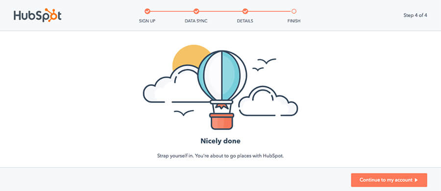
HubSpot’s onboarding process asks users some questions in the beginning and uses them later to personalize their dashboard as well as their workspace.
You can use a user’s job function to customize their learning curve. It becomes easier to recommend them learning material when you understand their motivations better.
7. Ask for feedback
Creating a robust onboarding process is a continuous journey. You should constantly be evaluating elements of the process to improve on them. Asking for direct feedback from the customers helps you understand their viewpoint.
You can sneak in the questions or put them all at the end of the session. HubSpot, for example, provides multiple choices for answers, so that users don’t have to think much and can choose easily.
Presenting clear choices to choose from increases user engagement. And feedback helps you improve in a way that you know will directly make an impact on your users.
Conclusion
User onboarding is a crucial process in customer retention, especially for SaaS companies. Only a user who understands the platform will be willing to come back for more.
Your focus should be on helping the users get the most out of your service. Making the process shorter and more actionable goes a long way toward turning trials into subscriptions and subscriptions into prolonging.
About the Author
Kerry Harrison is an experienced and passionate freelance writer with a First Class Hons Degree in Multimedia Journalism BA. She enjoys crafting content to help businesses grow.

