New Web Design?
Here’s Why and How You Should Keep It Simple
See also: Marketing for Freelancers
Let’s talk web design. With an estimated 1.7 billion websites online, business owners left and right are trying to find the design that will make them stand out from the crowd. How can they grab the attention of their visitors? The answer must be flashy web design, right?
Wrong! People might initially notice the neon colors or complicated design first, but they’ll be drawn to the websites that are easy on the eye, because those are easy to navigate.
If you were about to hire a web designer who recommends a design based on a mix of Warhol and Picasso, have a read and discover why a simple design will work better for your business.
What you’ll learn in this article:
- All the reasons why simple design wins over complicated designs.
- What we mean by simple design.
- How to simplify your web design or create a simple website.

Reasons to keep your next web design simple
Let’s turn it around: what would be a good reason to not use a simple design, but go for a complex one? You might say that you’d be unique and different from other businesses. Or that you have a great idea for a web design that people haven’t seen before.
But that’s where it stops, unfortunately, and those things aren’t what your website should revolve around. Usability and conversion should be your main concerns. Those two come together in UI design.
You might think design is just about looks, so what is UI design? UI stands for user interface. Basically, it’s the graphical layout of your website. The place your visitors will navigate and more around in.
Let’s say you run an e-commerce business. You want them to go from the homepage to the product they want, and then to the checkout. The interface can either make this easy, or incredibly hard.
Simple designs help conversion
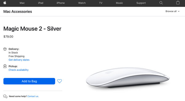
So, the first argument for keeping your website design simple is conversion. You take away any hurdles to buying. People don’t have to look for buttons or figure out what icons mean. The Apple website is a great example.
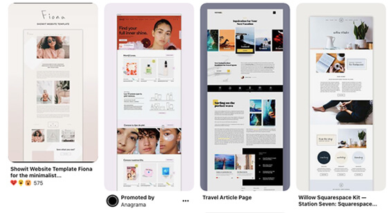
It doesn’t show anything unnecessary to avoid the paradox of choice: the more choices you give someone, the less likely they are to make any choice at all. Which website would you choose?

You become more trustworthy
‘’What are they trying to cover up with that flashy design?’’ It might be something your website visitors think if you choose to go the overly creative direction.
Simple design helps your credibility. Turns out, 75% of people judge a company’s credibility based on visual design alone. In the end, people choose the business they trust most, not the one who seems to have the highest design budget.
You make it easier to digest your content
Whether it’s blog posts or sales copy: it thrives in an environment of white space. The simpler your design is, the easier it is to scan it. Users don’t have the time to read your website word by word, especially if they’re scattered around the page.
58% of users will only skim articles. Help your readers by keeping the language simple, as well as the design. Show only what they need to know and lead them in the right direction as fast as you can.
Or simply take help from a Content Management System (CMS) to publish content digitally on a website. Getting help from a CMS is a good choice when you manage a large group of organizations and implement changes on their websites. A CMS allows multiple users to take a part in the creation and management of content.
Simple design is easier to work with
The chances are your business is evolving. Your website will have to keep up, and that means you will need to update your website every now and then. Now, if you don't have a team of designers and developers, you probably want to avoid jumping into lines of code. You could easily make a mess, which could lead to time-consuming repairs and an increase in web design cost.
If you do have a team working on it, you will also see the benefits of keeping it simple. They can make sure that every feature works 100% correctly, instead of having 100 features working only 80% of the time.
Simple design is cheaper
Not only to build, fix or work with, but also to host. The more content you will have on your side, the bigger your hosting plan needs to be. Especially if you want to keep things running smoothly.
Simple design helps your SEO
You design a website for your target audience, but also for Google. Better put: you and Google need to work together to get your website on the first page.
To do this, you will need to make your website easy to understand for the search engine. How your website is designed and structured will determine how easy it is for Google to crawl through.
The easier it gets from page to page, the higher you will appear in the search results. So, make sure you are following a logical pattern.
What do we mean by simple?
When it comes to design, one could argue that it’s very objective, and even simplicity can be interpreted differently. While that’s true to some extent, we can all agree that some designs are clearly simpler than others.
Visual complexity and prototypicality
A study by Google took this principle and studied how it would affect how much people like websites. They looked at visual complexity and prototypicality.
Visual complexity is how difficult the design is based on the level of detail. The more details, the more complex.
Prototypicality is defined as “the amount to which an object is representative of a class of objects”. For websites, you could translate this to how a layout is commonly associated with sites of their category. For instance, web shops for shoes: you expect them all to look more or less alike, right?
What Google found was that visually complex websites with low prototypicality were consistently judged as less beautiful than simpler websites. In other words: the simpler and the more ‘recognizable’ the design, the better.
The principle of least surprise
Prototypicality is also related to the principle of least astonishment or surprise. This is often talked about by designers when it comes to user interface. You will want to build a website that works in a way people expect it to. What does that mean?
- A play button is a triangle
- Your search bar is in the top right, as is your shopping cart
- If you want to go to the homepage, you click the logo in the left corner or middle
Luckily, most templates have these basics built in. But if you're starting to design a website from scratch, look at how most websites you are used to working with function, and copy that. You don't want users wasting time on figuring out how stuff works.
Keep it simple, stupid
You’ve probably heard of the KISS principle: Keep it simple, stupid. It was noted by the U.S. Navy in 1960, but applies perfectly to design. The acronym was coined by Kelly Johnson, an engineer who encouraged his team of designers to keep the jet aircraft they were making simple and fixable with only a handful of tools.
His reasoning? In times of war, you can't just sit around and order parts and wait until your mechanic is back. The aircraft would have to be repairable by any average mechanic in the field under combat conditions with only a few tools.
Keep this in mind when building your website: what if your web designer leaves? Will it still be possible to make changes, or should you start from scratch?
Fewer details allow for more attention
Simple doesn't mean sloppy or rushed. It gives you the time and space to put extra thought into what you do use. What colors and fonts will create a great-looking website without muss fluff?
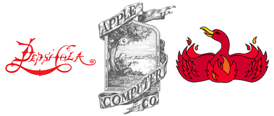
A great example can be found in logos of big companies. They've changed quite a lot over the years. Let's see if you recognize these logos instantly.

Bear in mind, these are companies that weren’t founded in the Middle Ages, so don’t be fooled by the fonts or images.
Ready for the big reveal?

That’s right. Pepsi, Apple, and Firefox have gone through quite the transformation to simplify their logo. A logo is a crucial point in any design and since it's so closely knit to your identity, it should be easy to recognize—and therefore be kept simple.
Three ways to simplify your website’s design
Have you been inspired to scrub your website free from all the unnecessary details and buttons? We’ll give you some points of action to create a clutter-free website.
1. Minimize the number of buttons
When it comes to the buttons on a page, keep it to a minimum. The example of Apple was great, but this also goes for pages where you’re not necessarily focusing on selling something. Take this page on remote SEO jobs for instance. You can either apply instantly, or read more information. Look at every page and determine what the key action should be, and only add buttons for that.

2. Keep your navigation bar clean
Keep things organized and don't give every individual page a place in your navigation bar. Keep it to a maximum of six main tabs and categorize other pages under those.
3. Use color in a smart way
Colors have meaning, and seeing a page colored like a rainbow can overwhelm people. Is green good or bad? Should they press that red button or leave it alone?
Sit down with your team and find out what colors match with your brand and message, and work with only those. This will also make it easier for people to recognize your brand.
For every piece of content you create, you should include things like color and fonts in your project charter documents, so you make sure everyone works according to the same design principles.
What could you simplify in your website?
Take a good, hard look at your website and be honest: what is unnecessary here?
People stare at a screen all day and decision fatigue is real, so do everyone—and your business—a favor by keeping your design simple.
